

The Power BI and Fabric Summit 2025
Tamica’s Highlights
The 2025 Fabric and Power BI summit was filled with a range of presentations demonstrating new and unreleased functionality. There was also a wide selection of sessions on best practices with Power BI.
What’s new for Power BI Creators:
From Mohammad Ali (Group Product Manager for Power BI)
A new release within the Fabric ecosystem is the use of Translytical Applications. This new functionality allows write-back functionality to databases in Fabric that appear almost immediately in reports. By bringing together our data storage, Fabric user data functions and Power BI, this new release allows for more possibilities of real-time data interactions with write-back capabilities without the need for the development of a separate Power App.
While Microsoft has been improving the functionality of Power BI and Fabric, one point that is noted by developers online is an increase in load times when opening Power BI Desktop. In this session, load times for Power BI desktop were demonstrated using the current version and the ‘new’ version, which showed a load time of only 4 seconds compared to 8 – reducing this load time by 50%. I am looking forward to seeing what other improvements Microsoft has made to increase the efficiency of Power BI.
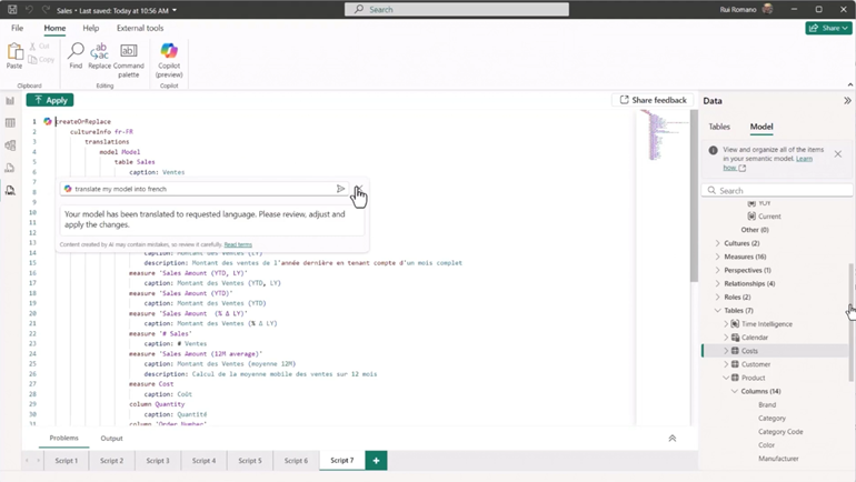
Another new piece of functionality that was released a few weeks ago but was demonstrated was the TMDL View within Power BI. This new view allows you to see your entire semantic model as a script and provides a straightforward way to bulk update and manage your model. By scripting a table from your model in TMDL view, you can bulk copy and paste code to create or update multiple measures at once. No more manually creating one measure at a time!

This new functionality has been enhanced by the introduction of Copilot. It’s now possible to ask Copilot to provide documentation for all your measures, columns and tables, which then automatically flows through to the metadata descriptions in the model. As a developer who understands the importance of great documentation, I can see that this new functionality will save me a lot of time that can be spent on more important development.
During this demo, it was even shown that Copilot could translate the entire model into French. While switching languages in your model might not be a regular task, I can see from this demonstration the world of possibilities and an increase in efficiency that these new releases can provide.
Other improvements in the Power BI application space are the introduction of multiple apps within a workspace. Which this can usually be managed though audiences – this new functionality allows a significant level of customisation in your apps.
By using ‘Org Apps’ which can be added as a new item in a workspace, you unlock more including:
- Full git/change integration
- Customisation of branding, navigation, content and headers more than the standard app
- The ability to integrate:
- other Fabric artifacts such as notebooks and real time dashboards
- links from Sharepoint, Excel or embedded links
A major change for me in this release is that because the ‘Org App’ is an artifact, you can customise how it behaves, including permissions. Previously you had to manually ensure that users had access to the items within the app but now once you give permissions through sharing the app, these permissions will be propagated to those users, bringing together features of Fabric, increasing customisation and reducing admin management time.
While we’re talking about Copilot, there were also announcements around the introduction of it into the Power BI hub experience. This allows searching of items with your Fabric ecosystem and can answer questions related to your content.
Make Power BI Run Faster – Thomas LeBlanc (Principal Consultant)
This session spoke on best practices to ensure that your Power BI models are kept to a minimum size and run efficiently. It was shown that a ‘flat file’ imported into Power BI containing all the facts and dimensions needed for reporting performed worse in file size and reporting response than a star schema model. This highlights the importance of ensuring that your semantic models are developed in line with best practices by following the star schema approach of separating your facts and your dimensions to ensure that your reports run smoothly for end users.
The use of external tools such as DAX Studio can also identify where your bottlenecks are occurring, whether this is in the ‘Storage Engine’ or the ‘Formula Engine’.
Storage Engine:
- Responsible for querying and retrieving data
- Can return pre-aggregated or filtered results to the Formula Engine
- Restricted to ‘simple’ aggregations such as SUM, DISTINCTCOUNT, MIN, MAX and COUNTROWS
- Faster than the Formula engine as it is multi-threaded
Formula Engine:
- Responsible for parsing, optimising and executing DAX expressions
- Does not directly interact with the data storage, instead sends requests to the Storage Engine when needed
- Processes row by row evaluations such as SUMX, IF, SWITCH, RANKX and other iterator-based functions
The use of the Performance Analyzer in Power BI was also explored. This can be used to capture the query times of your DAX expressions and visual reporting loads. This can then be used to identify which component of your report may be producing slower load times.
Rachel’s Highlights
Kicking off with the Keynote from Kim Manis – What’s New and What’s Next for Microsoft Fabric & Power BI
Kim Manis discussed how AI is transforming industries and how data serves as the critical fuel for AI. She highlighted the complexity of managing multiple data and AI products, which often require extensive licensing, integration, ETL, and training efforts. Microsoft Fabric aims to simplify this by acting as the data layer for the Copilot stack, ensuring that AI models have accessible and well-managed data.
In her Keynote, she likened Fabric to Microsoft Office, where different tools serve specific tasks but share a common experience and underlying foundation. Fabric provides a suite of data tools such as Data Factory for ingestion, data warehouses for storage, and Power BI for real-time analytics while maintaining centralised security, governance, and cost management.
Additionally, Kim was able to provide some figures highlighting the rapid adoption of Fabric. Working in the industry, it’s evident that Fabric adoption has been significant, but seeing the actual numbers—19,000 customers and 70% of the Fortune 500—reinforces its rapid growth. Even more striking is Power BI’s reach, with over 375,000 customers and 30 million monthly active users, which to me underscored its position as a leading product in analytics
Key innovations include Fabric’s AI-powered data platform, an open and AI-ready data lake (OneLake), and AI-enabled insights. OneLake, described as the “OneDrive for Data,” supports shortcuts and mirroring, allowing organisations to access and analyse data across multiple cloud providers without moving it.
The talk provided a high-level overview of Microsoft Fabric, breaking it down into three key pillars: AI-Powered Data Platform, Open and AI-Ready Data Lake, and AI-Enabled Insights.
For the AI-Powered Data Platform Manis demonstrated how Copilot is integrated into every workload, including a use case where a company could improve their customer churn. In the example the business were able to contact customers who had unsubscribe from their service with AI generated personalised emails that utilised the reasoning they provided to why they had unsubscribed with the emails translated based on stored geographical data.
The Open and AI-Ready Data Lake was highlighted through OneLake, described as the “OneDrive for Data,” enabling seamless data integration across platforms via shortcuts and mirroring, without requiring data movement.
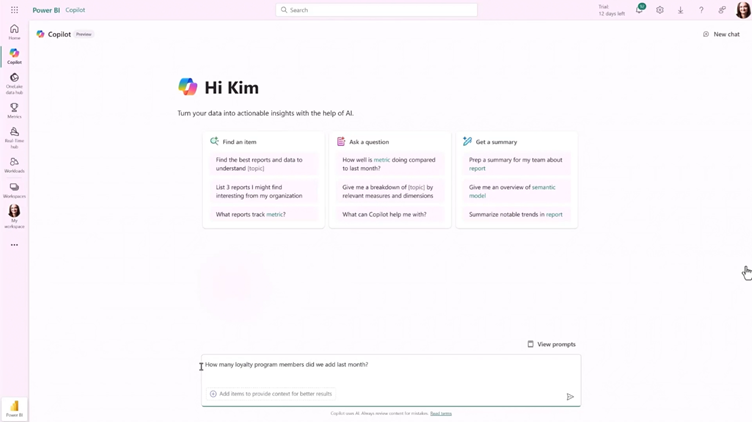
Finally, AI-Enabled Insights focused on Copilot in Power BI, which empowers users to explore and interact with their data using natural language.
A new paradigm, “translytical” data, was introduced to merge transactional and analytical workloads. What I found to be the most exciting part of the talk and maybe my highlight of the summit was a demo of a long-awaited feature in Power BI, having the ability to write back from Power BI into the original data source. The demo leveraged SQL in Microsoft fabric and showcased how a user would be able to update a backend source with changes through use of a new action type, “Data Function” attached to buttons.
Behnia Zarei’s UI/UX and How to Apply it in Power BI
Behnia Zarei’s session took us back to basics and got attendees thinking about what components are essential for creating visually appealing and user-friendly dashboards and reports. Sometimes it is important to explore and remind ourselves of these principles as it helps us as Power BI developers to design experiences that improve data comprehension, engagement, and decision-making for end users.
The presentation focused on how to apply UI/UX principles to create more effective and user-friendly Power BI dashboards. She began by emphasising the importance of creating dashboards that are intuitive, functional, and visually appealing.
She introduced key UI/UX principles like Gestalt psychology, which can be applied to dashboards. Principles such as proximity, similarity, and closure help in organising visual elements in a way that feels cohesive to the user.
Fitts’ Law and Hick’s Law were highlighted as essential considerations for streamlining user interactions and making important data easy to access and interpret. Zarei recommended using a grid system for alignment, following the Z or F reading pattern, grouping related data, leveraging whitespace to reduce clutter, keeping layouts simple, and limiting the use of colours and fonts to create a clean and accessible design. For visualisation, bar charts are best for comparisons, and misleading visuals should be avoided. Interactive features like slicers, drill-through, and bookmarks should be used to enhance usability.
The session also covered specific design techniques like using white space for focus, selecting the right charts for data types, and using interactive elements such as slicers and drill-throughs to make dashboards more engaging.
Additionally, she shared several useful resources and tools, which can all assist in making dashboards more polished and user-centric.
Advanced Power BI Visualisation: Pushing Limits with DAX and Smart Techniques by Benjamin Ejzenberg
Benjamin Ejzenberg’s session provided an in-depth look at advanced Power BI techniques that push the boundaries of data visualisation using DAX. The presentation contained 10 examples where he provided step by step instructions.
He demonstrated how to dynamically highlight key data points in Power BI, such as using DAX to highlight the highest and lowest values in a column chart. He also covered techniques for ranking data and maintaining drill-down functionality, ensuring that hierarchical views were preserved.
Ejzenberg introduced ways to enrich visualisations with dynamic elements, such as parametrized constant lines and smooth moving averages, which help users better understand trends over time.
One of the key examples involved adding dynamic data labels that change based on year-over-year growth or loss, with the use of colour and symbols for enhanced clarity.
He also demonstrated and explored some of the capabilities of new visuals, such as the “new card,” showcasing improved methods for achieving similar goals. Further, he covered the use of dynamic SVG icons to indicate growth or loss, making the dashboard more visually interactive.
Ejzenberg’s session emphasised the power of DAX in transforming static reports into dynamic, user-driven dashboards that provide deeper insights and greater interactivity.